360° Camera
Integration
This is the story of designing a new feature for a B2B SaaS platform built for large-scale construction site management. The product brings together the core workflows that site teams depend on daily: task tracking, defect logging, document management, report generation, all in one place. Through discovery research, a clear gap surfaced — one that users in the field had been running into repeatedly.
About the project
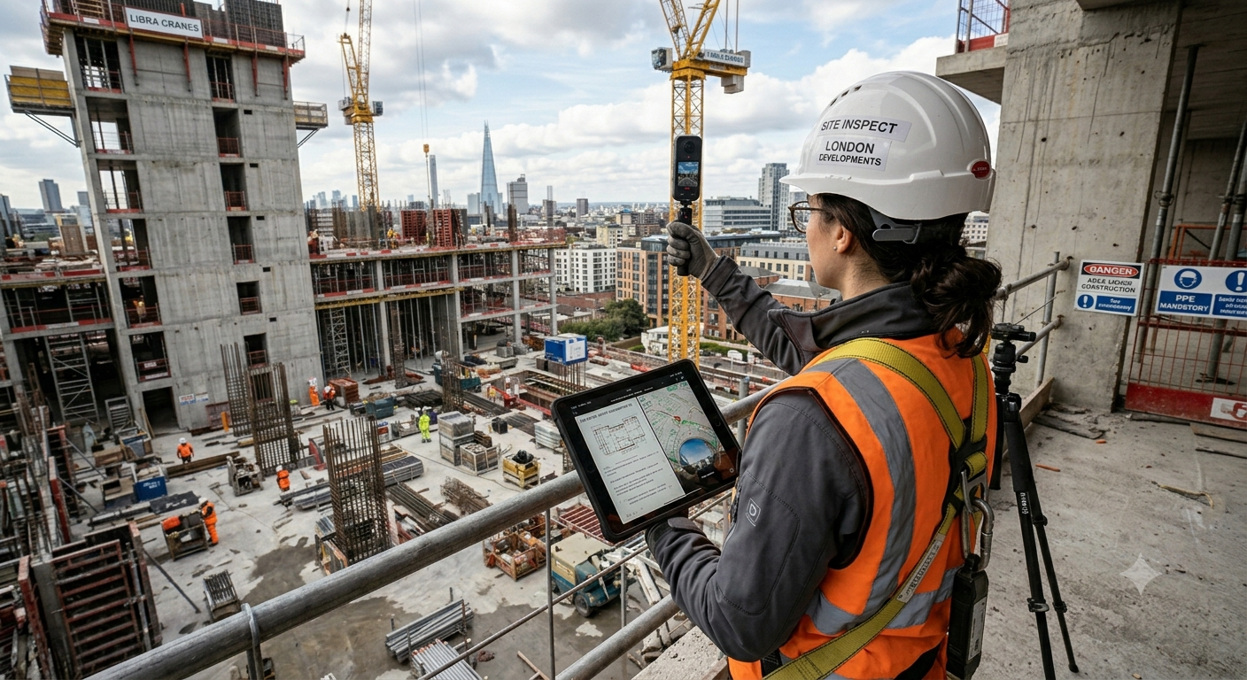
The project centered on integrating 360-degree camera support into docu tools, letting users capture 360-degree images, and eventually video, directly from a connected camera without ever leaving the app. Every photo gets saved to a pin, tied to whatever it belongs to: a task, a defect, a site entry. The documentation stays where the work is.
The decision to build this wasn't driven by what competitors were doing, even though some already had it. It came from users. The feature request board had been collecting the same ask for a while, from enough people that it was hard to ignore. Once that demand was pressure-tested against the market and the actual problems it could solve on site, it moved from "something users want" to something worth designing properly.
Hard constraints,
honest decisions
Three months. One designer. A product that construction teams rely on every day in some of the most demanding work environments around.
The timeline pushed for a lean MVP with no space for over-engineering, which meant every decision had to earn its place. Simplicity wasn't a nice-to-have, it was a hard constraint. Users on a busy site don't have time to figure things out. The feature had to feel obvious from the first tap.
Keeping everything inside the app was non-negotiable. No jumping to the phone's Wi-Fi settings, no switching to a native camera, no manual imports. The whole flow had to live within docu tools, start to finish.
And it had to feel like it had always been there. Not a new feature grafted on top, but something that belonged. Same patterns, same visual language, same logic as the image capture users already knew. If someone had to stop and think "wait, is this different?", the design had failed.
My design approach
The approach behind this feature was grounded in three core principles: solving a real problem, keeping the scope lean, and maintaining simplicity at every decision point.
Kicking it off
with interviews
Before any design work started, I ran a personal brainstorming session to figure out the right questions to ask. The goal was to go into interviews with something sharp, not a list that would just confirm what we already suspected.
Choosing who to talk to mattered as much as what to ask. Working with the CEO, who had direct relationships with our clients, we landed on three companies that each brought something different. One was already using 360-degree cameras regularly on site. Another was STRABAG, one of the largest construction companies in the world and our biggest client, who had only recently started working with the cameras. The third had no experience with them at all, but had been asking for this feature for a while through the request board.
That spread was the point. Talking only to power users would have skewed everything. Having someone who had never touched the camera sit alongside someone who used it daily gave the research a much more honest picture of what the feature actually needed to do.
What the interviews revealed
The interviews with users who already had camera experience were the most revealing. One shot covering a full spatial view meant dramatically fewer individual photos, less time on documentation, and real resource savings downstream. Time saved at scale is money saved, and the teams using it felt that directly.
Two things came up across every conversation: simplicity and accessibility. Not as abstract preferences, but as real requirements. On a construction site, a tool that slows you down gets dropped. No exceptions.
Two insights caught me off guard though. The STRABAG representative brought up face blurring. Their teams walk through crowded sites constantly, and evacuating an area before documentation isn't always possible. Without automatic face blurring, capturing 360-degree footage in those conditions creates a real privacy and compliance problem.
The other was about sharing. Users wanted to send a 360-degree view directly to a client, just the visual, nothing else. No internal task details, no defect logs, no pin documentation. A clean link to the spatial view so clients could see site progress without getting access to anything they shouldn't. Simple idea, but it wasn't something the product could do yet.
Finding out what
others do
Four products were tested hands-on before any design decisions were made, each picked for a different reason. Every product was tested end to end, actual flows, not screenshots, because there's no substitute for feeling where something breaks.




Turning transcripts
into signal
Three roles, a stack of interview transcripts, and pages of shorthand notes from watching people use the camera on site. Before any persona could take shape, all of it needed sorting.
I ran the raw interview data through ChatGPT to pull out recurring themes and pain points across roles. It cut the sorting time down considerably. But the model doesn't know construction sites or docu tools' users, so every theme it surfaced got checked back against the actual quotes and field notes before it went near a persona. What made it into the personas and journey map below was still my call.
Translating the
research findings
docu tools is a multi-role platform where the same screen can look and behave completely differently depending on who's logged in. Same pin, same project, but two users with different roles will see different information, different actions, different everything. That role-based structure isn't a detail, it's how the product fundamentally works.
Which is why a single-persona journey map would have missed the point entirely. It would have traced one path and left the rest invisible. A cross-role map was the only approach that made sense here — three personas running in parallel, each with their own permissions, starting point, and goal. That parallel view made it possible to see where the journeys crossed, where they split, and where the design had to do different things for different people within the exact same flow.
| Phase | User Goal | Actions | Pain Points | Opportunities | 😊 |
|---|---|---|---|---|---|
| Planning the Capture | Define where and when to take 360° photos | Identify rooms/areas needing capture · Assign person · Open app and floor plan | Overlooking areas · Coordination between field and office teams | Visual floor plan overlays showing capture status · Checklists per floor/area | 😐 |
| Capturing 360° Photos | Take one 360° image per room or area | Connect supported 360° camera · Tap pin on plan or place new one · Capture image via app | Poor lighting · Network interference during upload · Manual setup for each shot | Offline mode with sync queue · Central positioning assistance for better image quality | 😃 |
| Uploading & Tagging | Ensure the photo is securely saved and correctly linked | Image auto-uploaded · Photo attached to the selected pin on the floor plan | Connectivity issues on-site · Confusion if image isn't linked clearly | Upload confirmation messages · Visual tag (date/author/device) in photo metadata | 😠 |
| Review & Share | Verify and distribute captured images | View 360° photo from pin · Confirm visual quality · Share via secure link | Lack of privacy filters · Client confusion navigating interface | Built-in face blurring · Simple "drag to look" viewer · Email or QR-based sharing | 😊 |
| Using & Archiving | Use captured images in reports or for final project handover | Generate project documentation · Include 360° images in reports · Download/archive as needed | Hard to retrieve specific photos later · Manual backup burden | Auto-organize by pin/floor/date · Bulk export/download per project | 😌 |
Technical discovery
Before ideation, there were weeks of back-and-forth with the head of development. Not a kickoff meeting. Ongoing conversations that ran alongside the tail end of research, all circling the same question: how far could we actually go?
Both of us had a physical Insta360 camera to work with, which kept things grounded. No guessing what the integration might support. We could test it, hit the edges, and design around what was real rather than what seemed plausible on paper.
By the time ideation started, the boundaries were already drawn. And that was the point. Knowing exactly what the first sprint could and should deliver meant no time was wasted designing for things that weren't on the table yet.
Coming up with
new ideas
The typical ideation path goes sketches, low-fidelity wireframes, then gradually up to high fidelity. This project skipped the middle.
Working in an agile team with three months to deliver, and an internal design review due before that, a drawn-out ideation phase wasn't an option. But it didn't feel like cutting corners. By the time ideation started, the research, interviews, competitor testing, and weeks of technical discovery had already done most of the thinking. The feature was small and deliberately simple. The direction was clear.
There were rough sketches. Messy ones, useful only to me, not worth showing here. What came after them was a direct jump into high-fidelity design, not out of impatience, but because the groundwork had already answered the questions that low-fidelity is usually there to answer. Skipping it was the honest call.
Designing
the feature
Feature Activation in User Settings
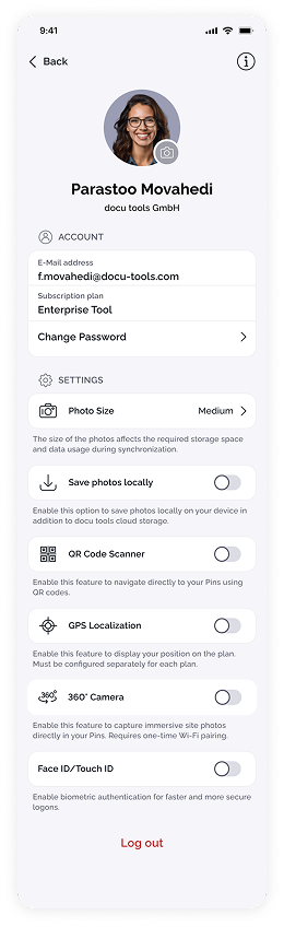
The feature lives in user settings, right alongside GPS, Face ID, and everything else users already know how to switch on. Same toggle pattern, same placement. No explanation needed.
A short hint text sits beneath it: "Enable this feature to capture immersive site photos directly in your pins. Requires one-time Wi-Fi pairing." Enough context to know what they're turning on before they commit to it. Nothing more.
Camera Pairing Flow
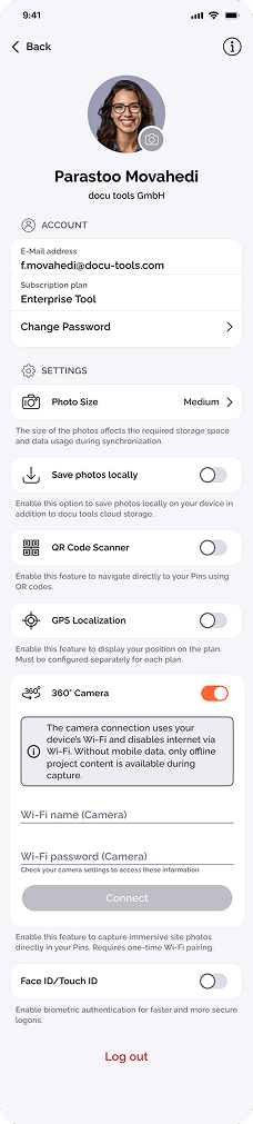
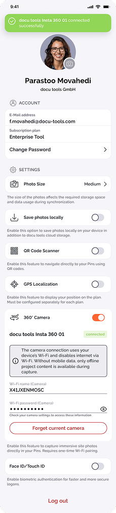
Activating the toggle opens an expanding section underneath it, asking for the camera's Wi-Fi name and password. A small hint text points users to where those credentials live in the camera settings. A second note handles an important technical reality: pairing with the camera takes over the device's Wi-Fi, which means no internet access for the duration of the capture.
The connect button stays greyed out until both fields are filled. A successful connection triggers a green snackbar and a green badge — a persistent indicator that the camera is live. The button becomes "Forget Current Camera" for anyone who needs to switch devices. The pairing is remembered, so next time, none of this is necessary.
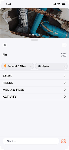
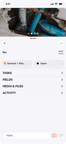
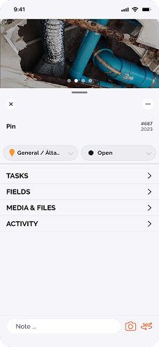
Capture Flow
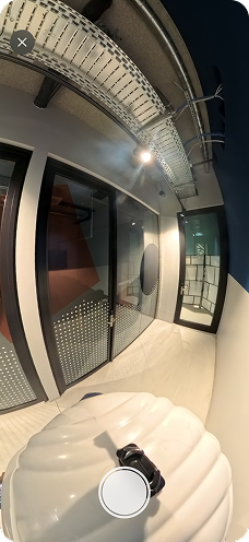
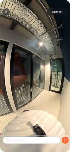
The capture screen is bare by design. A camera view, a capture button, a close button. That's it. For an MVP on a three-month timeline, anything more would have been noise.
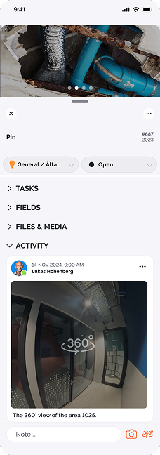
After the shot, users land on a review screen where they can add a short description, retake if needed, or close and discard. Once saved, the image shows up in the activity view, tied directly to the pin it came from. No hunting for it later.
Viewing and Annotation
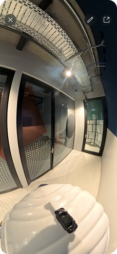
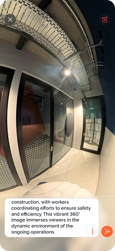
Opening a saved image brings up a viewer with a small annotation toolkit. Users can mark points directly on the image, flag a defect, call out an area of concern, whatever the documentation needs. It was never seriously considered leaving this out of the first MVP. Construction documentation without the ability to mark things up is only half useful.
Deletion isn't an option, consistent with how docu tools handles documentation integrity across the rest of the product. Images can be archived. Comments can be edited. Nothing disappears.
Visual Pin Indicator
A small visual indicator sits on any pin that has a 360-degree image attached. One glance and it's clear what has spatial content and what doesn't. No opening pins one by one to find out.
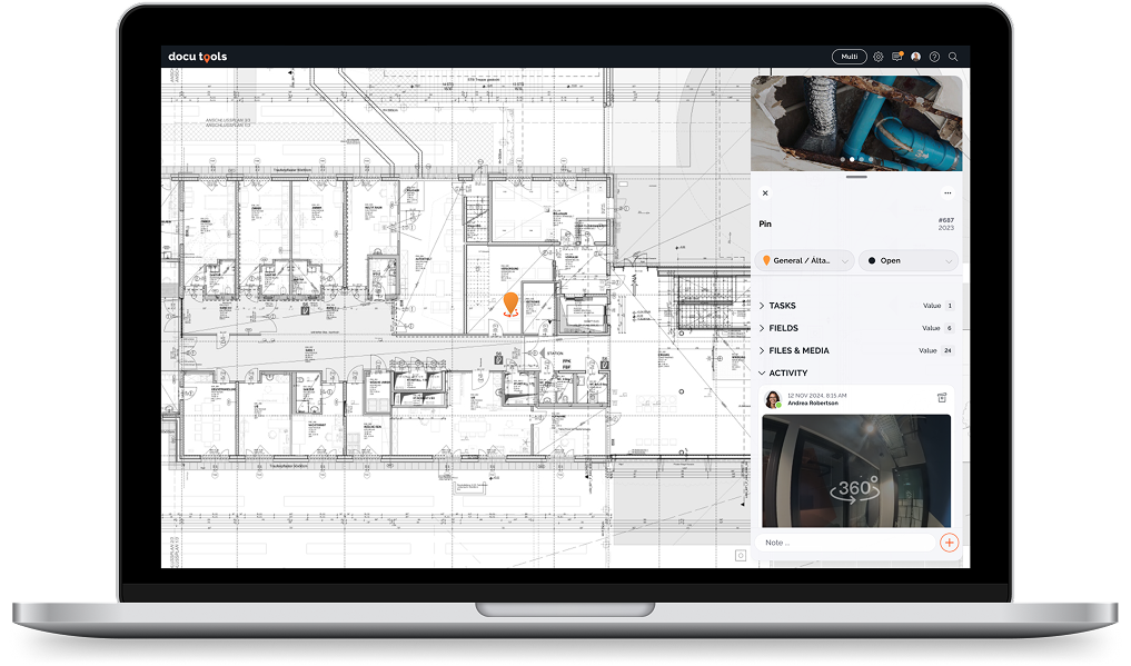
Tablet and Web Experience
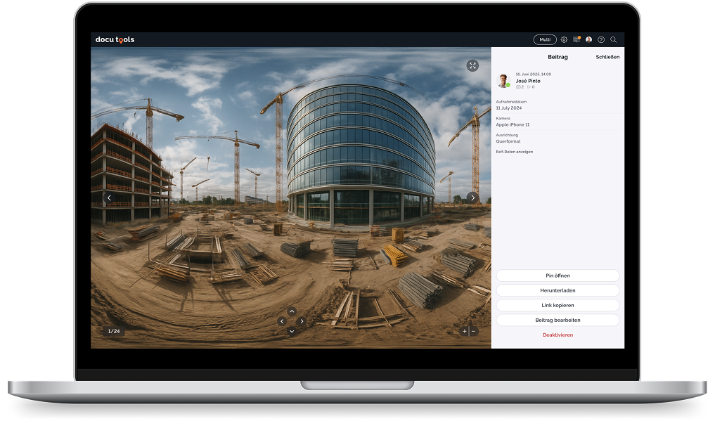
The web app has no capture flow. Users there aren't on site, so it doesn't apply. What it does have is a full 360-degree viewer: pan, tilt, zoom, the full spatial experience from a desk. For office teams and clients who need to see the site without being there, that's the whole point. Tablets follow the same flow as mobile. The layout adjusts for the larger screen, but the logic doesn't change.
Report Integration
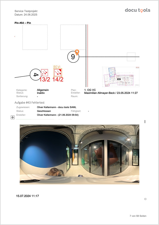
Since 360-degree images save as JPEGs, they can be exported as flat panoramic files and dropped straight into docu tools' existing report templates, right alongside standard photos. No new infrastructure, no extra steps. The reporting workflow stays exactly the same.
Designing for
when things break
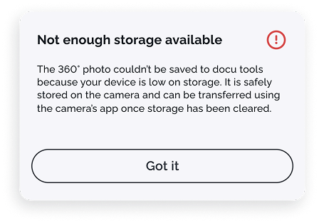
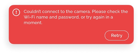
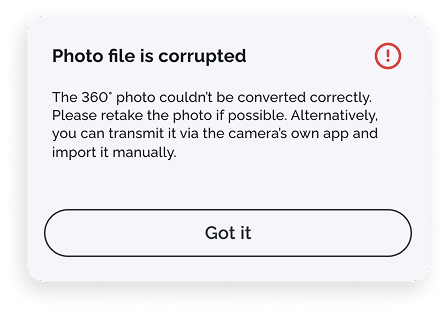
Good error handling isn't an afterthought. Through testing, dev conversations, and working through edge cases, three failure states were identified and designed for.
Early signal,
clear enough
The first MVP didn't go to everyone. It went to the users who had asked for it most — STRABAG and a handful of other clients who had been pushing for this feature through the request board. Starting there made sense. Their feedback would be immediate and grounded in actual use, not curiosity.
The response was positive. Genuinely so. This was also the last feature I shipped before leaving the company, which meant there wasn't much time to collect detailed data or track how things evolved. But the early signal was clear enough: it was working for the people it was built for.
What I'll
carry forward
Doing this as a solo designer was one of the better experiences I've had. Owning every stage — research, interviews, competitor analysis, design, beta — gave me a clarity about the process that's hard to get when pieces of it belong to someone else.
The thing I'll carry forward most is how much research does for you when timelines are tight. One designer, three months, a product with real complexity underneath it. That could have gone sideways fast. But because every decision had something concrete behind it, the scope stayed honest and the calls were easier to make. In a product that already asks a lot of its users, adding something new without that grounding would have been irresponsible. Simplicity isn't just good design. It's consideration for the person on the other end.
B2B work always means balancing user needs against business priorities and stakeholder expectations. That tension never fully goes away. But on this project, the research earned its place at the table, and the feature that shipped reflected what users had actually asked for. That matters to me.
I'm proud of where this ended up, and curious to see where it goes next. If you have questions or thoughts on anything in this case study, I'd love to hear them.
Explore the full design
Research data, findings, and all design decisions are documented in the Figma file.